
You have written the headline, gathered the photographs and listed the details. Then comes the question that determines how it all fits together: do you need a flyer or a folded leaflet?
Start with the reader. What should they understand, and what should they do next? A single offer may need very little space. An introduction to a business may need a clear sequence of information. The format should follow that job.
First, a word about the names
For this comparison, a flyer is a flat sheet, printed on one or both sides. A folded leaflet uses folds to create separate panels. You may also see “leaflet” used more broadly, so check the actual format and specification when choosing a product.
The practical difference is how the reader meets the information. A flyer puts the main message in front of them straight away. A folded leaflet can reveal it in stages as the panels are opened.
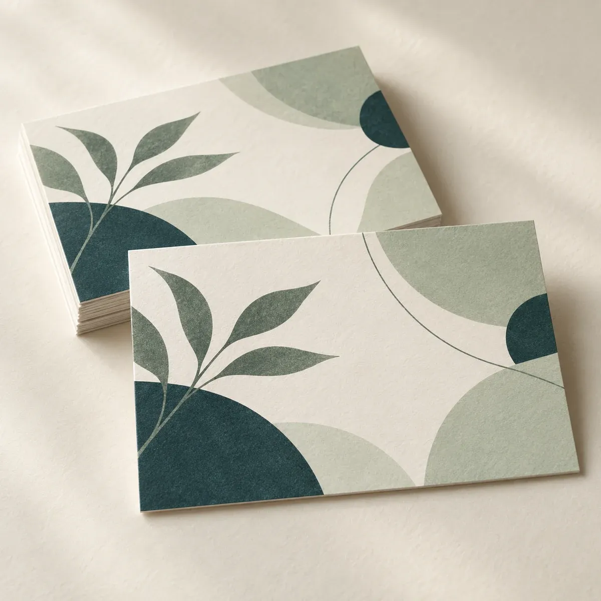
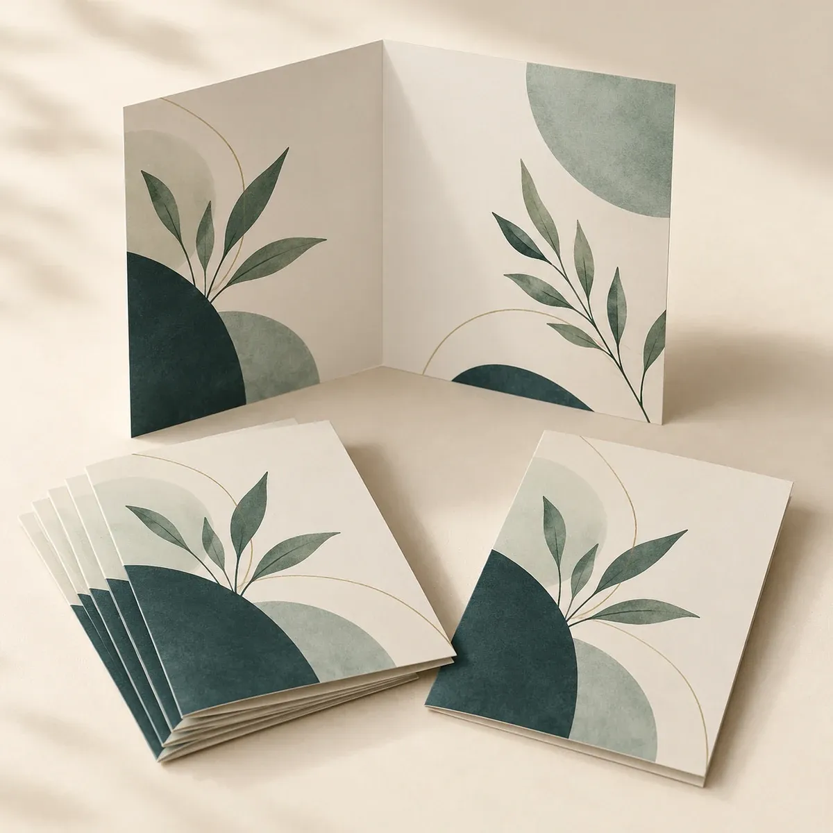
Choose a flyer when there is one main thing to say
A flyer suits a message that someone should grasp while passing a noticeboard, collecting a takeaway or talking briefly to your team at an event.
It might announce a workshop, introduce a seasonal offer or invite people to an open day. Give the reader one clear reason to pay attention, the details needed to act, and an obvious next step.
Here is an example of the information a fictional community workshop might need:
Get your bike ready for winter
A practical workshop for everyday cyclists
Saturday 14 November, 10am–noon
Riverside Community HallBring your bike. Book your place at [web address].
The reader can identify the event, check the date and decide whether to book. A photograph or simple illustration could help set the scene, but the essential information is already clear.
If you need to explain the organiser's entire history before someone can understand the invitation, separate that background from the immediate message. A web page can carry supporting information while the flyer concentrates on the action.
Choose a folded leaflet when the reader needs a route through the content
A folded leaflet becomes useful when there are several related questions to answer. Someone considering a service may want to know who you are, what you offer, how it works and how to get in touch.
Imagine a small creative studio introducing itself to local businesses. Its information could be organised like this:
- Front panel: the studio's name and the kind of work it does.
- Introduction: who it works with and the problems it helps to solve.
- Services: a short, ordered account of its main areas of work.
- Process: what a client can expect from the first conversation onwards.
- Example: one relevant project, with a photograph and a concise explanation.
- Contact: the next step and the details needed to take it.
That is a content plan rather than a fixed panel template. The number and order of panels depend on the size and fold you choose. Check the product options and print template before turning the plan into a layout.
Give each panel a purpose. A fold should help the reader move through the story, rather than simply divide an oversized block of copy.
A quick format check
| Your main task | A useful starting point | What to prioritise |
|---|---|---|
| Announce an event or a single offer | Flyer | Headline, essential details and one next step |
| Introduce several related services | Folded leaflet | A clear order and a distinct role for each panel |
| Give someone a reminder after a brief conversation | Flyer, if the message is short | The benefit discussed and a way to follow up |
| Leave more information after a detailed meeting | Folded leaflet | Useful answers the reader can return to later |
| Present a long programme or a large range of products | Consider a booklet or supporting web content | Enough space for the information to remain readable |
These are starting points. A flyer can explain a service, and a folded leaflet can advertise an offer. What matters is whether the amount and order of information suit the reader's task.
Write a content plan before opening the design file
Put the necessary information into a plain document first. Mark what the reader must notice immediately, what they need in order to decide, and what can be left for a website or a conversation.
For a flyer, that might mean one headline, a short explanation, a few practical details and a call to action. For a folded leaflet, group related information and give each group a working heading.
If a panel contains three unrelated headlines, several offers and a long company introduction, the copy needs another edit. Extra panels do not remove the need to prioritise.
Use photographs, colour and typography to reinforce the hierarchy. Give the reader a clear place to start, and make contact details easy to find. Keep text clear of folds and trimming areas in accordance with the selected print template.
Think about what happens after it leaves your desk
Where will the print be used? A piece displayed at a reception desk needs to fit the available stand. Something handed out at a conference should be practical to carry. If it is going in an envelope, check the folded size as well as the unfolded dimensions.
Make a paper dummy before committing to the layout. Fold it, turn it over and read it in the order a new reader would. This often reveals a missing introduction, an awkward page turn or a contact panel placed where nobody expects it.
Show the dummy to someone who has not been involved in the design. Ask what the organisation offers and what they would do next. Their answer is more useful than asking whether they like the colour.
Compare costs using the same job
There is no single answer to which format is cheaper. Quantity, paper, size, printing and finishing all affect the quotation. Compare the actual specifications you need, rather than assuming that one product name always means a lower price.
A small saving is less useful if the design has become too crowded to read. Equally, several panels may be unnecessary for a message that works comfortably on one flat sheet.
Choose the format that gives your content enough space, then compare the available options within that format.
You can give each format a different job
A business attending a trade show might hand out a short flyer to introduce an offer, then give a folded leaflet to people who want a fuller explanation. The two pieces can share colours, typefaces and a clear next step without repeating every detail.
If your content keeps growing, consider a booklet, a web page or a combination of print and digital information. Reducing the type size again and again is a sign to rethink the plan.
Explore Flyers for a focused message and Folded Leaflets for information that benefits from separate panels. Start with what your reader needs to know; the right format should make that easier to understand.